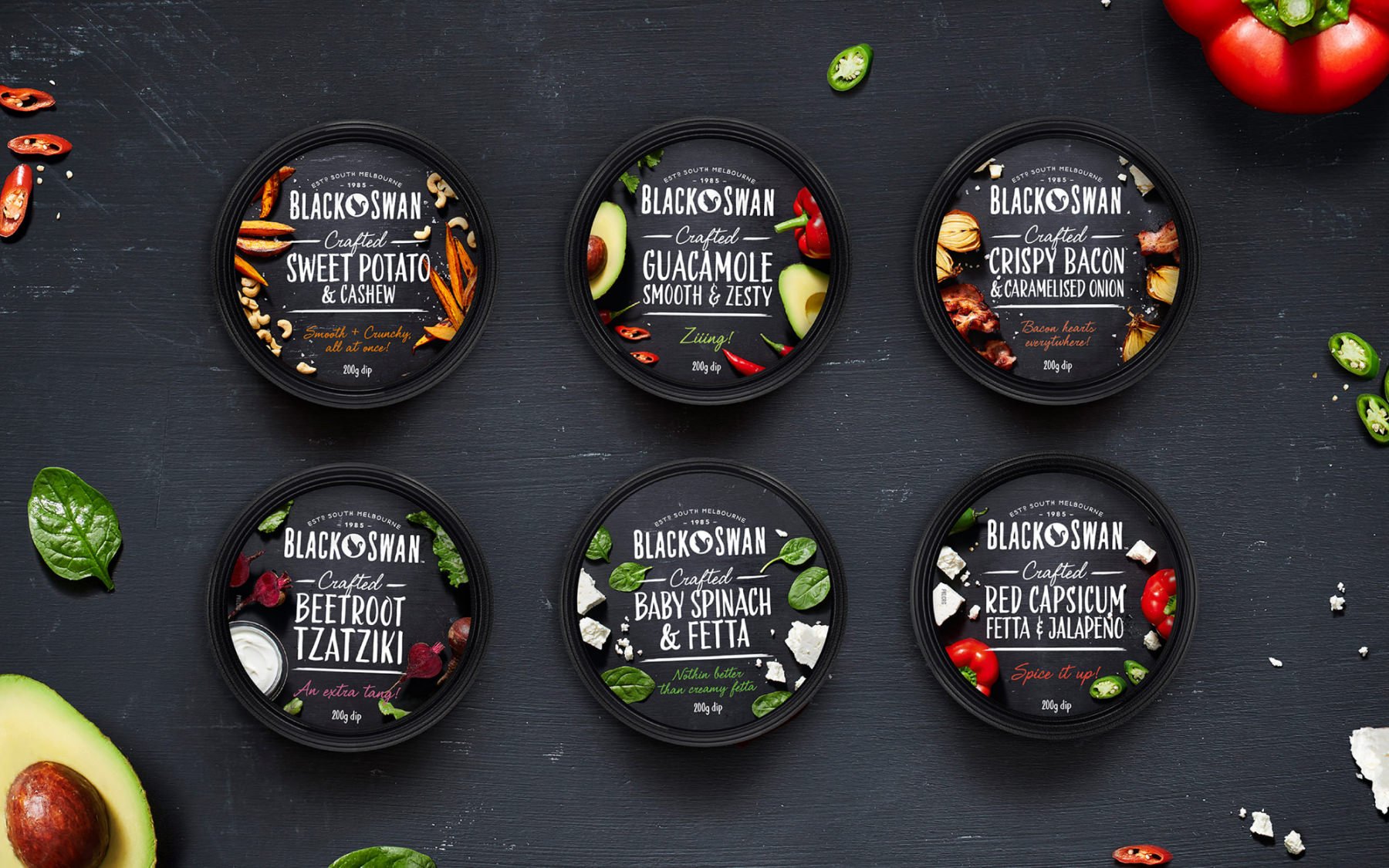
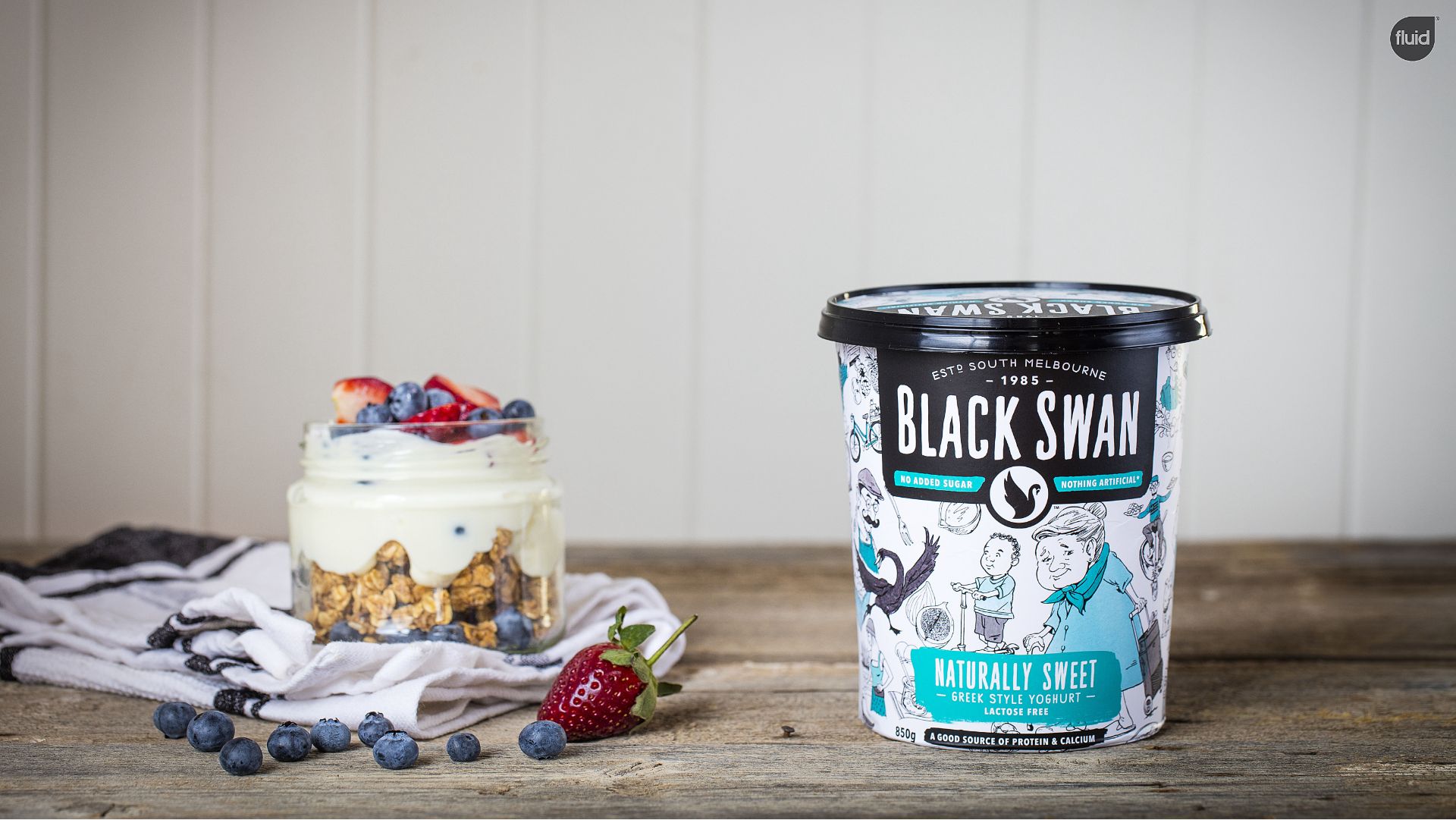
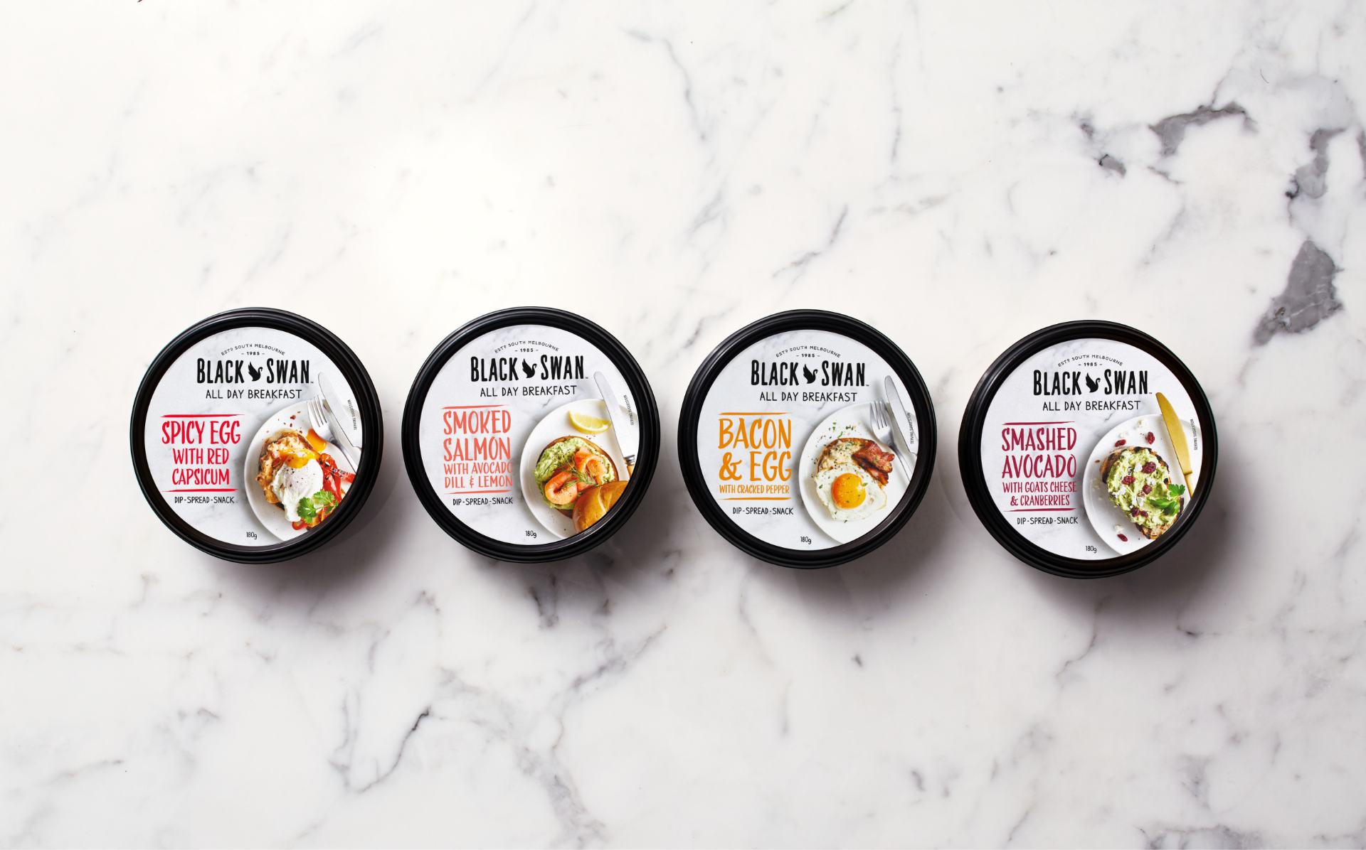
Black Swan's iconic food brand started as family business with a passion for bold flavours and experimentation in the rowdy South Melbourne Market in 1985.
Black Swan dips needed to reposition their brand. Over time they had lost ground to new competitors, losing their distinctive positioning. They needed to reengage audiences with distinctive packaging, and a brand proposition that they could engage with that went beyond simple product benefits.
Solution
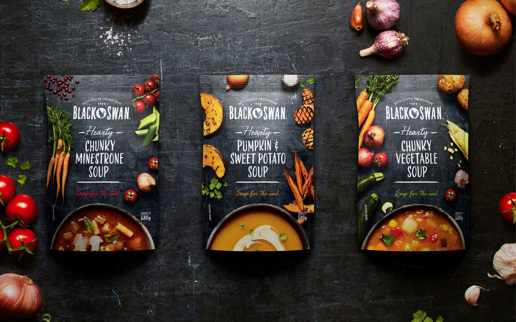
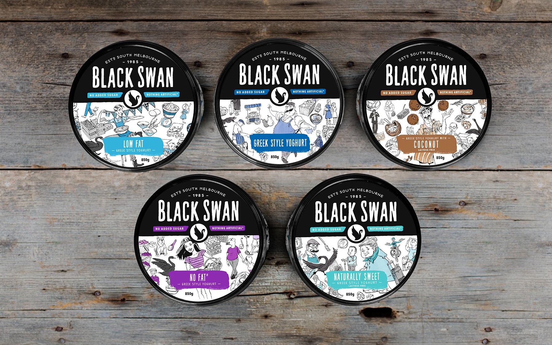
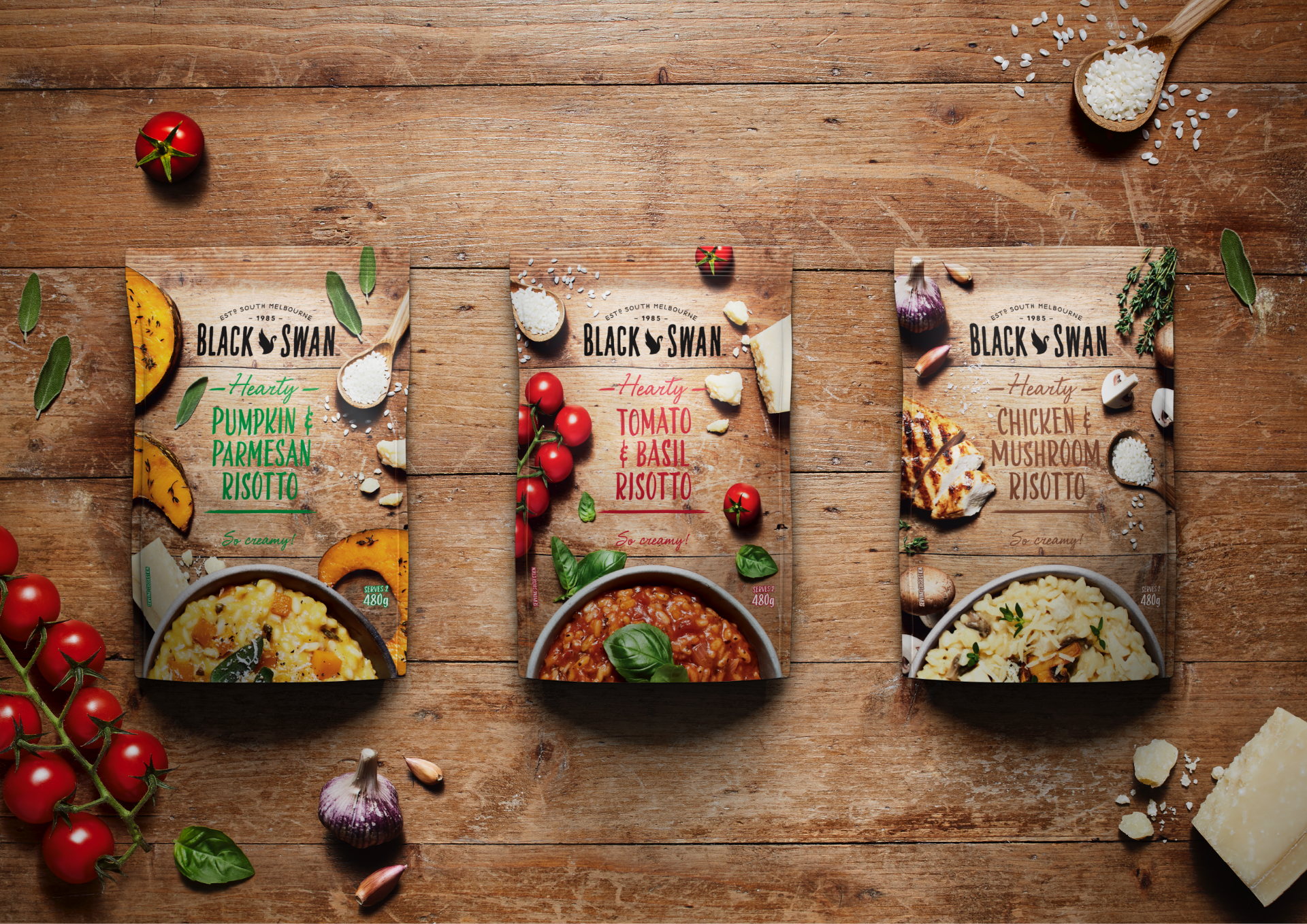
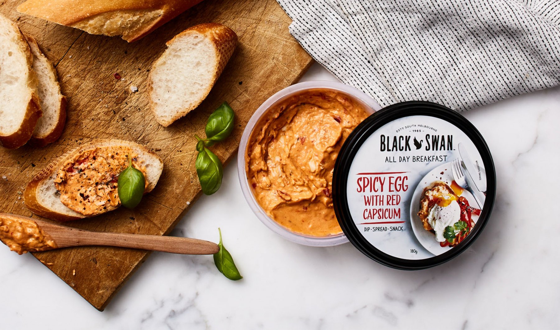
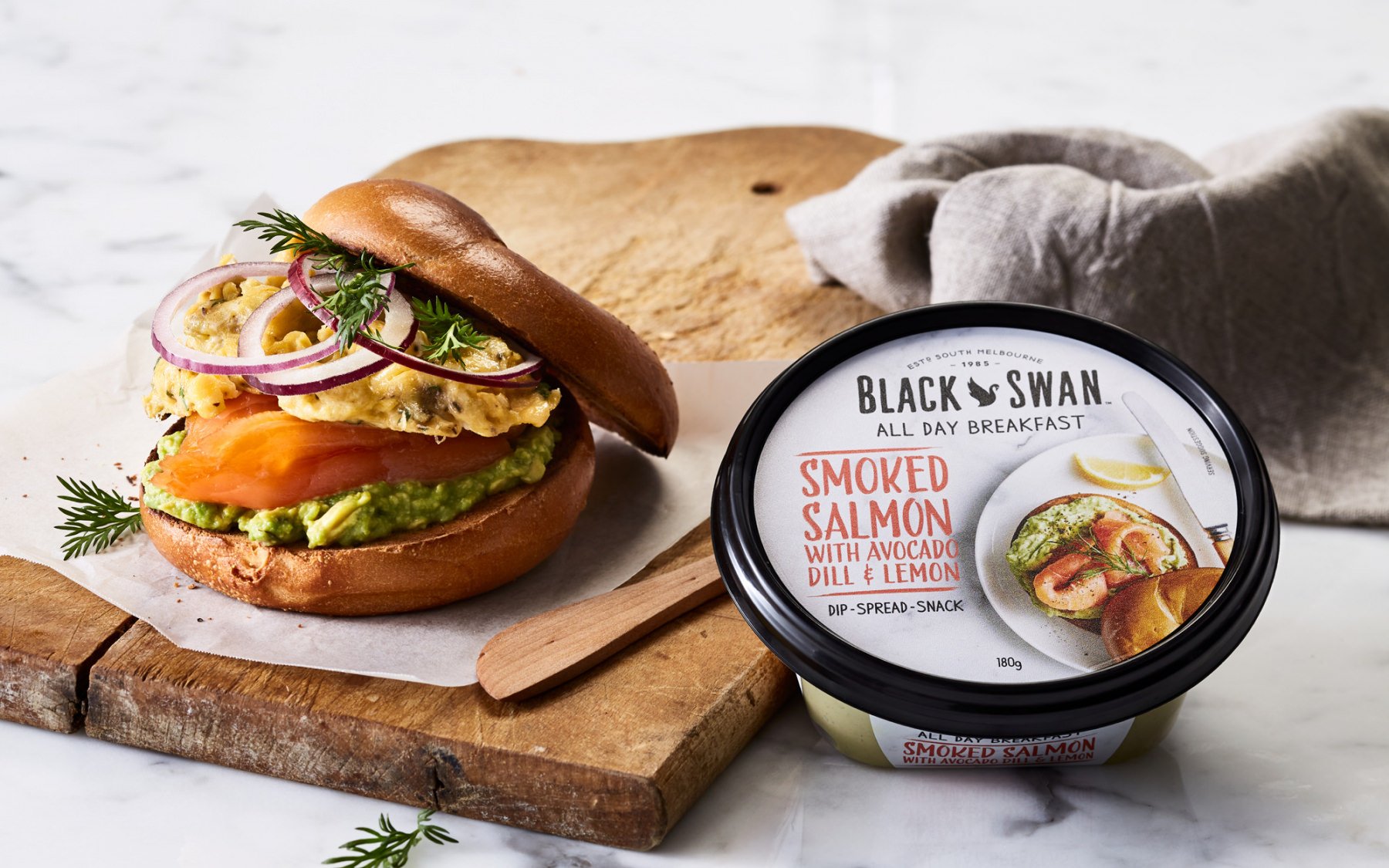
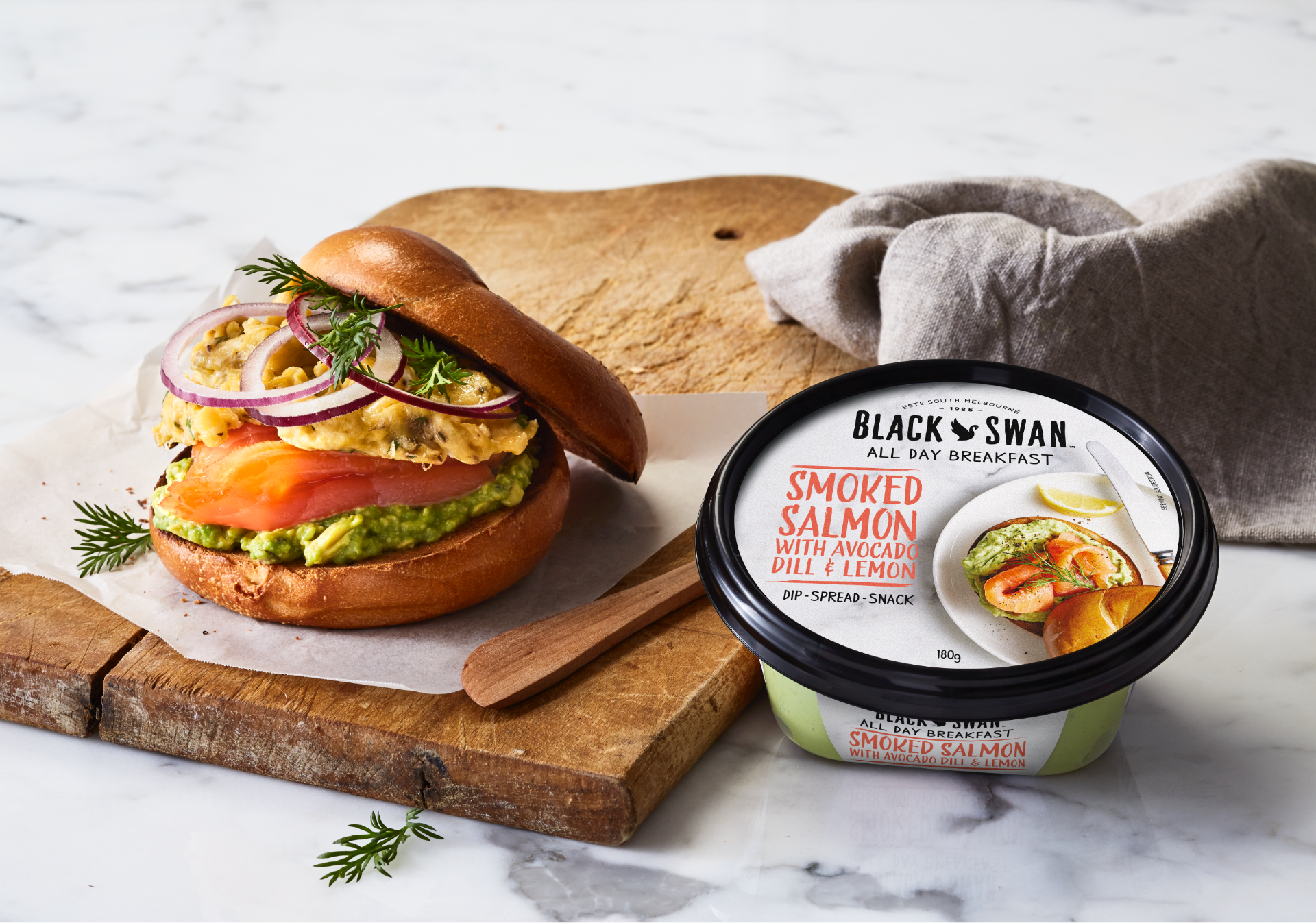
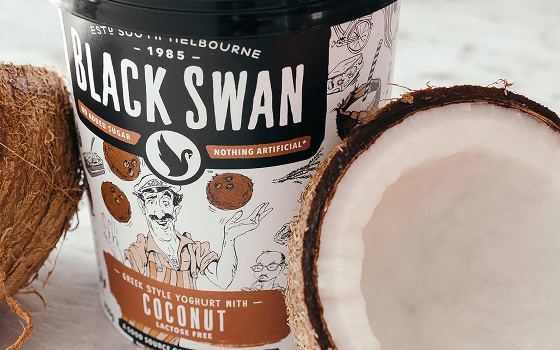
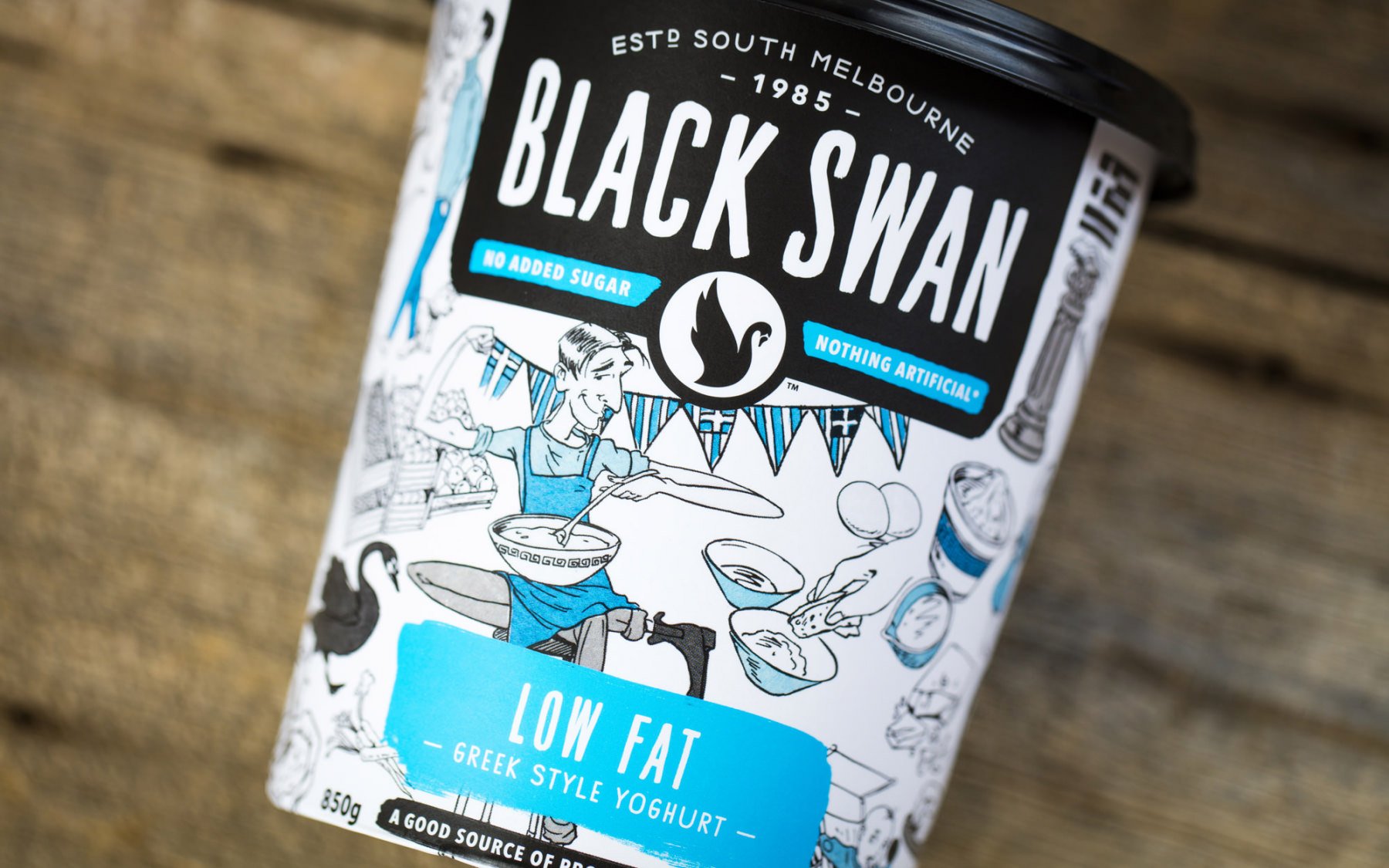
Fluid developed a new brand story built around the brand’s authentic heritage in the South Melbourne market, utilising their strong black brand colour in a new way to better connect their visual assets with their brand story. Embracing a crafters personality that was all about combining the right ingredients in the right way to create bold flavours, the brand had a story that could be used to platform into new product development, activations and new category brand extensions.
Outcome
Black Swan was nominated for a 2016 AGDA Award and sales significantly increased as the new positioning was leveraged into new soup, risotto and dips ranges.
Awards
2016 AGDA Award Packaging Finalist
Visit the awards page
The Black Swan dip rebrand was the first pack redesign that I ever completed where a sales manager stated, in front of a buyer, that an aesthetic change to the brand and packaging resulted in a sales increase.
Kirstin O’Brien – Marketing Manager, Monde Nissin Australia